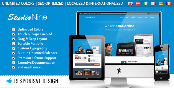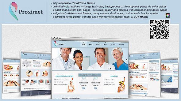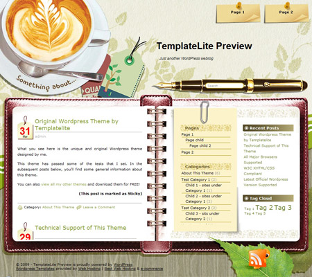
Theme Features
Coffee Desk Details:
Latest Version: 3.0
Updated on: 2011/03/31
Here it goes. The Coffee Desk, my newest theme that I am very proud of
I should have released it last week but I got stuck in making the theme compatible with ALL major browsers. I have tried many ways in HTML and CSS but just couldn’t make it display well in major browsers. Finally, I am glad that I found the solutions using jQuery!
This is the first theme I created 3 months after the “Simple Style” theme. Sorry to let you all wait for so long but I will my best to release at least 2 quality themes per month. Hope you like the Coffee Desk theme and visit this site regularly for more releases in future!
The following is an example of a custom design of the Coffee Desk theme.
 |
 |

– Free forum support. visit Coffee Desk forum
– Nice background. Best viewed with a resolution of 1280px
– Compatible with IE7, IE8, Firefox, Chrome, Safari, Opera
– W3C XHTML and CSS compliant
– Gravatar enable
Things to take note
Header Links
1) Limit the number of the header links to 4 only. If you display more than 4 links, the “paper note” will overlap with the “coffee cup”.
2) Control the length of the links to within 2 lines.
Blog Title
Currently, the blog title is using the Arial font. You can change the font style by following this instruction:
– Open “header.php”
– Remove this code
<div id=”blogtitle”><a href=”<?php echo get_option(‘home’); ?>”><?php bloginfo(‘name’); ?></a></div>
– Save the file and upload to your server
– Open “images/bg_header.jpg” in image editing software
– Add your desired font and content to the image
– Save the image and upload to your server
Blog Description
If you don’t want to display the blog description, simply remove this line from “header.php”:
<div id=”subtitle”><?php bloginfo(‘description’);?></div>
Post Title
Coffee Desk theme allows up to 2 lines for the post title without distorting the design.
Bottom of the Content Area
The white space size below the content area is not a constant. Sometimes you’ll see a big gap, sometimes the gap is small and fits well. This is a design constraint and is not an error.
User Showcase
The followings are a few examples of nice modification of this theme from other users. You can view all the nice design in the forum theme showcase.
 |
 |
 |
View my other themes
Change log
2009-02-24 v1.00 – Release
2009-03-05 v1.01 – Fixed comment display problem in IE.
2009-04-21 v1.02 – Modified the javascript to fix the height of dynamic content.
2009-05-11 v1.03 – Moved Javascript to a .js file. Fixed Tag Cloud widget display problem.
2009-07-14 – Theme is compatible with WP 2.8
2011-03-31 v3.00 – New – Added drop-down menu, ad-widget, Options page, advanced automatic thumbnails, custom style, custom menu (works on WP 3+ onwards) and enabled localization (translation).
