Theme Features
Laverde Details:
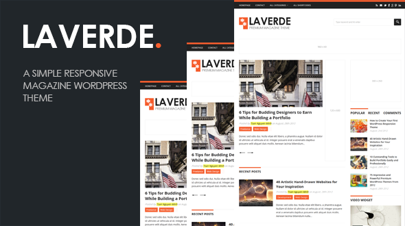
Laverde is a simple responsive magazine WordPress theme designed specifically for the Magazines, News sites and Blogs. It’s very clean, minimal and professinal. Laverde is a fully responsive theme, which means it adapts to the screen resolution of the device it is being viewed on. Your website will be equally usable and good-looking whether it is being viewed on large monitors, laptops, tablet devices, and smartphones.
Theme Features
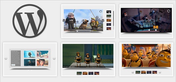
Featured Slider
A custom homepage featured slider to showcase your important content, all powered by the fully responsive FlexSlider, which makes it usable on mobile devices. You can turn on or off the slider anytime in Theme Options.
Styling Options
You can change the color scheme of the theme by enable this feature in the theme panel. The theme supports unlimited color styles and has styling options for top border, footer border, widget border and links.
Social Share Buttons
The theme supports social share buttons most popular social networks as: Twitter, Facebook, Google Plus, StumbleUpon, Linkedin and Pinterest. You can see buttons in single post view and can turn on or off this featured a click in theme options.
Custom Built widgets
Advanced functionality baked right in and you can add and remove widgets in a simple drop and drag. Custom widgets include: Twitter, Flickr, Facebook, Subscribe form, Advertising, Video and bundles more.
Advertisement Manager
With Laverde, you can place 125×125 banner images and 300×250 banner images in your sidebar, 960×90 at top and 120×600 at slider. Advertisements are handled from within wp-admin, and can be turned on and off at any time.
Search Engine Optimization
In the code hierarchy, the main content block is placed before the sidebar regardless of the sidebar position, so it is crawled first by search engines. Another very powerful SEO feature has been implemented regarding Heading (h1, h2, h3,…) tags in that on the Home page the ‘h1’ tag is assigned to the site name and the rest of pages/posts/archives etc., the main Title has been assigned an ‘h1’ tag.
Responsive Layout
The design will scale to fit on all browser widths/resolutions and on all mobile devices. Go ahead and scale your browser window and see the results.
Theme Options
The theme has some pretty nifty features built into the stellar Theme Options Panel. It’s easy to get a hand on the many options, with ease and simplicity.
Custom Navigation
Our Menus has officially become part of the WordPress core. WP Menus allows you to customize the themes navigation to include pages, categories and custom links.
Sidebar Manager
Sidebar Manager allows you to add or remove all widgetized sidebars, footers in our themes by simple drop and drag unique custom widgets.
Custom Shortcodes
All of our themes support custom shortcodes. You can add web buttons, columns, alerts and many more cool things into your posts using these shortcodes.
Custom page templates
Our themes come packaged with a full width page template without the sidebar, and archives page templates for efficient quick links to all posts.
Localized for Translations
All of our themes have been localized for easy translation. Included with each theme are sets of .po files that can be used to translate the theme.
Browser Compatibility
We insure that all of our themes are compatible with the most popular internet browsers. It’s important that your website performs well for everyone that visits it.
24/7 Support
First of all, Thanks so much for purchased our items. We’re really appreciated it and hope you enjoy it! If you need support, all support will be conducted through our support forum ( http://www.uxde.net/support/ ). We usually get back to you within 24 hours.

