Theme Features
Modelish – Unique Details:
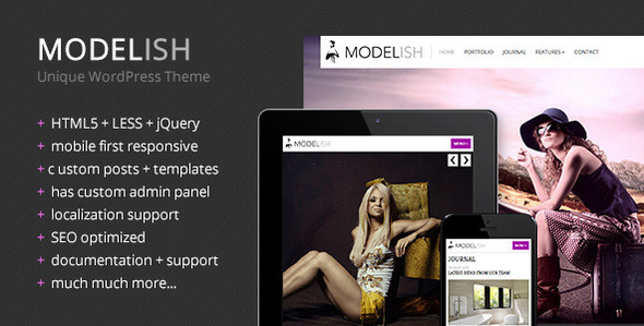
Modelish is a unique modern HTML5+LESS fully responsive WordPress theme for presenting artwork or photography, but can be customized for any business. Highly optimized with mobile first techniques and retina display support, this template will bring style and a modern feal your audience has never seen before. It’s unique customizable system with LESS variables makes it easy to adapt to your favorite colors, fonts and style preferences.
If you like this template, please consider giving it a quick rating, everything helps out! If you have comments, questions or something has gone terribly wrong… please contact me via my profile. Thanks for your support!

Features
- HTML5 + LESS + CSS3 + jQuery
- Fully responsive + 12 column grid + retina display
- Mobile first approach (optimizes bandwidth for smaller screens)
- SMOF admin panel
- Can manage header logo, site favicon, custom site image (for Facebook) and Apple touch icons
- Set SEO meta attributes like description and keywords
- Ability to add custom CSS style and Google Analytics script
- Updates automatically from latest ThemeForest version (no need to manually re-download the theme)
- Can change base color, link colors, background color+pattern, google fonts and CSS3 animation applied to common elements
- Easy homepage customization panel with multiple options
- Customize layout for portfolio & journal custom templates
- Set contact form options: email address for receiver, subject line, additional information textarea and Google Maps embed
- Ability to edit custom post names and slugs (useful for localization)
- Ability to backup and restore the admin options
- Custom Post Types for portfolio, staff members & testimonials
- Custom meta-box attributes for various items
- Over 45 personal shortcodes (tooltips, buttons, accordions, tabs, social icons, responsive video, gmap, chart, etc)
- 3 custom sidebar widgets included (Recent Posts with thumbnails, Recent Testimonials and Flickr Feed)
- Localization support (default.po & default.mo)
- Import .xml file included to get the same data as in the demo preview
- Supersized image gallery (options for autoplay, slide interval, transitions and performance)
- Full-page video (based on a YouTube or Vimeo ID/URL, can set volumke, loop and HD playback)
- Panorama360 view (options for 160°/380°, sliding controls, automatic scroll and scroll speed)
- Responsive video container
- Detailed page with layout manager for FlexSlider, iOSSlider, Call-toAction Box, Latest Work, Clients, Video Player, General Shortcode Text and Features
- Unique pages: About, Our Staff, Testimonials, 404 Error Not Found, Search results
- Common elements: typography, grids, lists, tables, forms, buttons, tooltips, dropcaps, quotes, alerts, toggle panels, accordion wrapper, tab container, lightbox gallery, pricing table, GMap and GChart, social icons, pagination, etc…
- CSS3 hover transitions with smooth animation: shake, flash, bounce, tada, swing, wobble, wiggle, pulse, flip
- Contains AJAX based contact form + PHP sendmail script (no need for other plugin)
- Responsive static image for Google Maps in contact page
- Layout scales down perfectly to mobile
- Included PSD for main sprite file for customization
- Images are not included in the final purchase file
- Documentation + support
Diverse variations of home page that contain:
Updates
13 April 2013 - Version 1.0

    First Release
Credits
I’ve used the following sources as listed below:
- LESS CSS
- 960px grid
- jQuery
- HTML5 Shiv
- Respond.js
- Window smartresize
- Tabify
- OKFocus Video
- Supersized Gallery
- FlexSlider
- Fancybox
- iosSlider
- jQuery Form Plugin
- My personal Panorama360 plugin
- Tipsy Tooltips
- jquery.nicescroll
- My personal Bronto CSS Menu
- Meta Box
- Aqua Resizer
- SMOF
- freepixels.com images (not included)
